We have assembled a new cut of the animation based on the testing activity collected during the first 9 months of developing DevCreek. It now includes a short guide on reading the animation and the inclusion of auditory cues. The sounds go some way to highlighting a number of the rhythms present during development.
A version of this video was included in the ACM OOPSLA’07 conference.
Watch it on YouTube
Frames
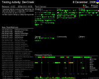
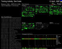
Layout of each Frame
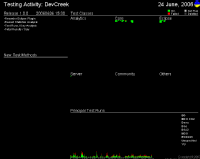
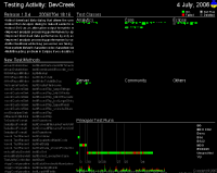
Each frame of the animation represents an additional hour of testing activity. The entire animation covers 1021 hours of activity, and the results from 1.1 million test method executions.
Principal test runs are presented towards the lower-right of the frame. Each thin vertical mark corresponds to a single test run executed by the named tester or principal. A green mark indicates that all the exercised test methods passed, red if any failed. Later test runs are introduced on the left edge, pushing existing ones towards the right. This sequence of results reflects the testing practise employed. The passing days are distinguished by a vertical doted line and the day of the month.
Test classes at the upper-right of the screen depict every single test method written by the team. All test methods from the same class are formed together as single unit. The size of the class unit represents the number of defined methods. Methods are added to the class in the order they are detected, appearing along the right then bottom edges before repeating.
Each class is grouped within a module, and added in the order it is detected. Analytics covers the analysis of captured activity events and report generation; Core is common code shared across modules, including the framework to process streams of event data; Eclipse includes all the plug-ins for capturing developer’s event data from different languages, and to provide feedback; Server implements the server API to collect and redistribute client contributions, and the public website; Community is the wiki based community website; Other for third-party libraries and unclassified experimental code.
Test methods are colour coded based on whether they have been executed during the frame’s duration: green if every execution passed, red if it failed any time, light grey if it wasn’t executed at all, or dark grey if the method no longer exists within the code base.
New test methods are listed in order along the lower-left edge of the frame. New tests methods added during the frame’s duration are introduced to the top of the list, pushing existing methods downwards. Any methods added during the frame are highlighted in white.
The current release is shown at the top-left, with the time-stamp of its publication and a list of all the features implemented by it.
An activity time-line along the lower edge of the frame aggregates all of the test runs together. The total test runs for each day are shown, stacked by failed atop successful. The start of each week and month are marked. The frame’s day is highlighted with a white mark, and a gold speck marks the publication of a new release.
Reading the Movie
The intent of the original version of the animation was to start with the short beat of test/implement/refactor (TDD) and explore whether this formed a rhythm, and if this rhythm varied over the course of the project. As a bonus, would there be any other rhythms formed at a larger scale? For example would releases, iterations and so on be present or not and would they represent any structure.
Such rhythms unfortunately don’t stand out as boldly as I would have liked from the visual stream of the animation. Alternating red/green test run results hints at testing style and challenges with the code. The test classes section shows the wave of new development, with the occasional bloom of red failures for significant changes or failures to contain the testing scope.
The ear is very good at detecting short repeated patterns from the stream of incoming sounds. Changing tack the new cut of the animation adds a sound stream with notes triggered by three types of events; public releases of the software, added test methods and the start of a new day of testing. These frequently occurring events are present in the visual stream but are dominated by the more colourful red/green of the test runs and test method state. As your eyes focus on the testing, the sounds compliment the activity and help to structure the passing time. The ‘ting of the new public release breaks up the 9 months into more reasonable durations. The drum and crashing noises for new test methods and new day combine to indicate hours of testing per day and if reasonable numbers of new test methods are being added.
Finally with the sound in place I have felt my first tinge of shame. Its now clear that I’ve forgotten to wear my clothes into work on more than a few occasions. The two weeks of repeated crashing that rush by with little testing happening at all. The days with frantic testing activity, but not a single new test method being added. I can imagine myself hacking away without a care in the world, fooling myself over the correctness of the new code but merely confirming that I hadn’t broken any of the existing code. Seeing this feels like progress indeed.
Originally posted on community.devcreek.com