Representing the testing activity of a developer has been an area that we have explored on a few occasions. There are a number of reports that graph the totals of test runs, tests run, failure rates, and so on by day or over other intervals. Though these reveal some useful information, especially in combination with each other, so far they haven’t been so successful representing the activity in direct way. A way that reveals, or at least hints at, the testing style of a developer. Do they practice test first? Do they scope out their work by writing many failing tests, then make them pass one by one? Are they refactoring, or actively adding new tests?
We feel that some progress has been made in representing this activity with our Test Run Ticker.
For example, here is a trace from the Eclipse client for a session refactoring and extending some code:
Each darker thin vertical tick indicates the execution of a test run, green for a successful run, red if any of the tests failed. The last test run is to the left, and runs age rightwards at a constant rate. Each test run tick is associated by a tail, shown in a lighter shade to the left, whose thickness relates to the number of test methods that either passed or failed in the run.</p>
From the left of the display, we can read a successful test run of hundreds of test methods, preceded by a successful test run involving a couple of test methods. That was in response to a test run failure of a single test method. Reading back towards the left, we can see that a broken test method was fixed, by probably running a single test class, then all the tests in the project or system passed as a final check to make sure there were no side-effects from the fix.</p>
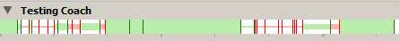
The same test runs are also presented on the DevCreek website:</p>
Again, test runs are indicated by a single pixel vertical tick. The last test run is on the left hand side, and older runs are to the right. Grey is used to fill from the right hand side if insufficient test runs have been recorded to fill the entire area yet. Rather than spacing ticks by time passed, they are simply stacked one after another. Information representing the size of the test run is not present with this variation.</p>
Though the time aspect of the Eclipse variation can help while reviewing a development session, the more focused website display of just the test run ticks can give a more direct and clearer view of the activity patterns.</p>
Some simple readings of the images:</p>
 All green does not represent active testing; either continuous confirmation testing after micro-refactorings, or new development not covered by any testing at all
 All red suggests the developer is in trouble
 Rapid alternations between red and green suggest active testing. Test first development often results in more red than green
 Rapid alternations followed by an extended section of green seems to correspond with simple refactorings and tidy ups before an integration
Hints as to the testing rhythm of a developer are present, for example in comparison to  . The first has a quite regular pattern of taking attempts to add and fix test, and once running immediately moving onto the next task. The
second has greater variation between periods of successful and failed test runs, with a tendency to repeated successful runs.</p>
. The first has a quite regular pattern of taking attempts to add and fix test, and once running immediately moving onto the next task. The
second has greater variation between periods of successful and failed test runs, with a tendency to repeated successful runs.</p>
Of course there is an aspect of the reading of tea leaves here, but the straight forward rendering of a limited type of event that corresponds so directly to the actions of the developer seems promising at this point.</p>
We are interested in hearing your feedback on the readability of these ticker “tapes” and if you feel they represent your own testing activity in a useful manner.
Originally posted on community.devcreek.com