I missed it the first few times it was mentioned. I then assumed it was an in-joke amongst all these North Americans. Later mistook it at as a compliment on a team member’s attire. Eventually, I realized they were all taking about one of our charts, the so called “t-shirt” chart.
The project’s mentor had earlier gobbled up a snapshot of the collected activity data, fed it through some custom analysis code, and with the begrudging assistance of Excel, was starting to generate a range of charts. Rather than focus on trends over the course of the project, the generated charts instead reflected more the questions of an inquiring programmer interested in their own testing activity; what have I just done? what does my average day look like? what about the average week?
One such chart that stood out was related to the number of test runs for each hour of the day. Here is our version of that chart, for the DevCreek project itself:
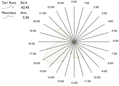
Starting from midnight, and stepping around the 24hr clock face you can see the average number of test runs for each hour of the day. This is collected from half-a-year of elapsed time, by a handful of programmers.
When this is traced out, it reveals our favourite t-shirt shape; the morning and evenings arms and afternoon body.
The early bird gets in sometime after 8:30 and starts testing. The second member of the team arrives by 10, we start talking and planning and manage some testing. Taking a breather, it’s time to head out to the pub for lunch sometime after midday. Suitably refreshed, we start focusing on the real work of the day, hitting our stride by 3 or 4 in the afternoon. With a good stretch of 3 or 4 hours under our fingers, we start to wind down, and are away by 7. The occasional hour or so of work in the evenings over the winter months. A day in the life of the DevCreek team.
What about the traces for other teams?
Here are traces from two teams within the same extended project.
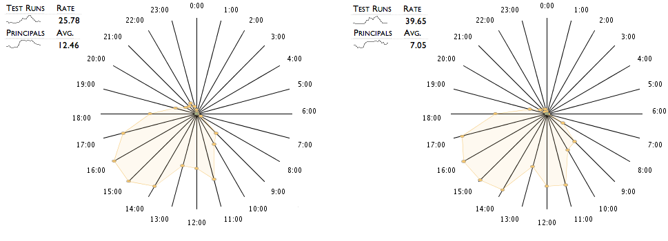
We can see a lot of similarities between the traces of the two teams. The morning ramp-up in testing is delayed by the project standup meeting at 10am.
The effect of lunch seems less pronounced in comparison with the DevCreek trace, perhaps this team are project room snackers? More likely, the greater number of team members involved cause more “averaging” in the trace as lunch as taken at different times.</p>
As a comparison, here are two other projects, in this case with much smaller teams.
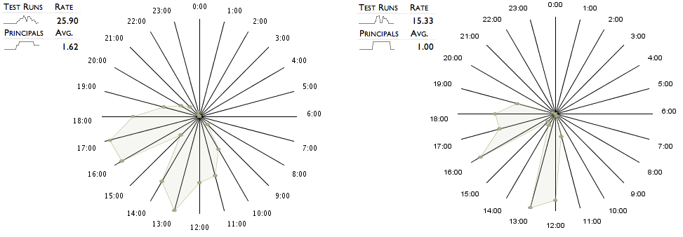
Without the averaging effect of many team members, the traces become far more distinct.
As a final pair of traces, here are two projects which share the same nucleus of team members. Most of the team was moved after the completion of the first project, shown on the left, to start the second project, shown on the right.
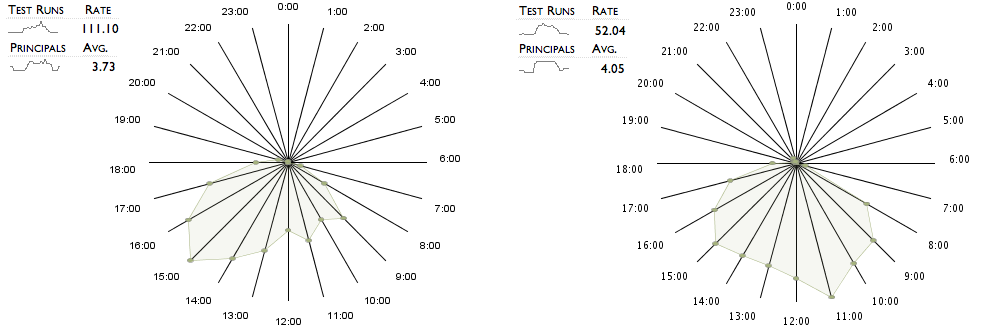
The two traces look more different than you might expect. Still, you can see that this team starts earlier than the other teams that we have seen. The second chart has an early bulge of testing activity at 11am, which is unique.
These charts, and the data they are calculated from, definitely suffer from a lack of rigour in collection and preparation at this stage. Their value would no doubt be improved by showing them together with additional metrics. Acknowledging these limitations, they do seem to reveal some of the common features of a project’s day. It might be interesting to see how accurate the team member’s understanding of their activity was by asking them to sketch out their own version of the day.
Originally posted on community.devcreek.com